Happy Memorial Day weekend. Thanks to those who paid the ultimate price for our freedom. We spent the long weekend doing a random assortment of small home projects - capped off by a socially distanced meal with family.


The Hong Kong vs. China tensions are something that needs more attention paid to it. Coupled with the US vs. China relations going downhill, the China problem isn't getting smaller.
Staying with China, they withdrew their GDP guidance for the first time ever. We never trusted the actual number, but it was presumably directionally correct. Now, China can't even make up a believable GDP growth number. That's messed up!
Staying in Asia, Japanese CPI dipped below zero. Shinzo Abe has been trying to fight deflation in Japan using a whole host of tools and hasn't been able to stoke the inflation fire. Japan is the best example of a central bank trying to fight economic gravity and paying the price for a long, long time. We fear that this the future of the USA and Europe if central bankers don't take heed - but it might already be too late.
Regarding inflation and the end of GDP growth in the US, this chart shows money supply vs. GDP potential. As money supply has increased, GDP potential has decreased. Literally, we've been borrowing from our future to fight short-term economic pain. And that means the future isn't as bright as it could be if we took the pain and moved on.
What increased money supply leads to is increased leverage. And companies being able to survive longer than they should. As policy has been eased since the Taper Tantrum, leverage has gone from ~5x D/EBITDA to nearly 6x today in Q1 of this year. It's likely higher now as debt has further increased while EBITDA has decreased. Leverage adds risk and risk has to have consequences - write your Senator!
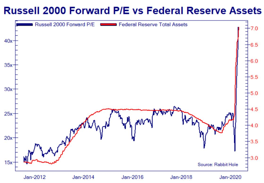
We've shared a lot of charts that show breakdowns in historical relationships between a data series and stock prices. Well, we finally found a chart that shows a relationship holding! (Lesson: don't fight the Fed)
Another chart that shows a positive correlation is Robinhood user positions vs. the market. This rally has been very heavily driven by retail investors - aka "Dumb Money"
Moving back to our bread & butter of real data that no longer explains the stock market, we've got S&P forward earnings estimates vs. the S&P 500. The historical correlation is 0.90 - so changes in earnings estimates explain 90% of the market's gyrations. However, since the low in March - the relationship is -0.90! Meaning, reductions in earnings estimates explain 90% of the markets upward movement. Lower earnings, higher prices. Makes sense, right?
Getting to some domestic airline data - this is a chart showing April 2019 vs. April 2020 flights at the 6 busiest US airports. Whenever we hear about air traffic being at 20% of "normal" we wonder WHO IS FLYING!?!?!
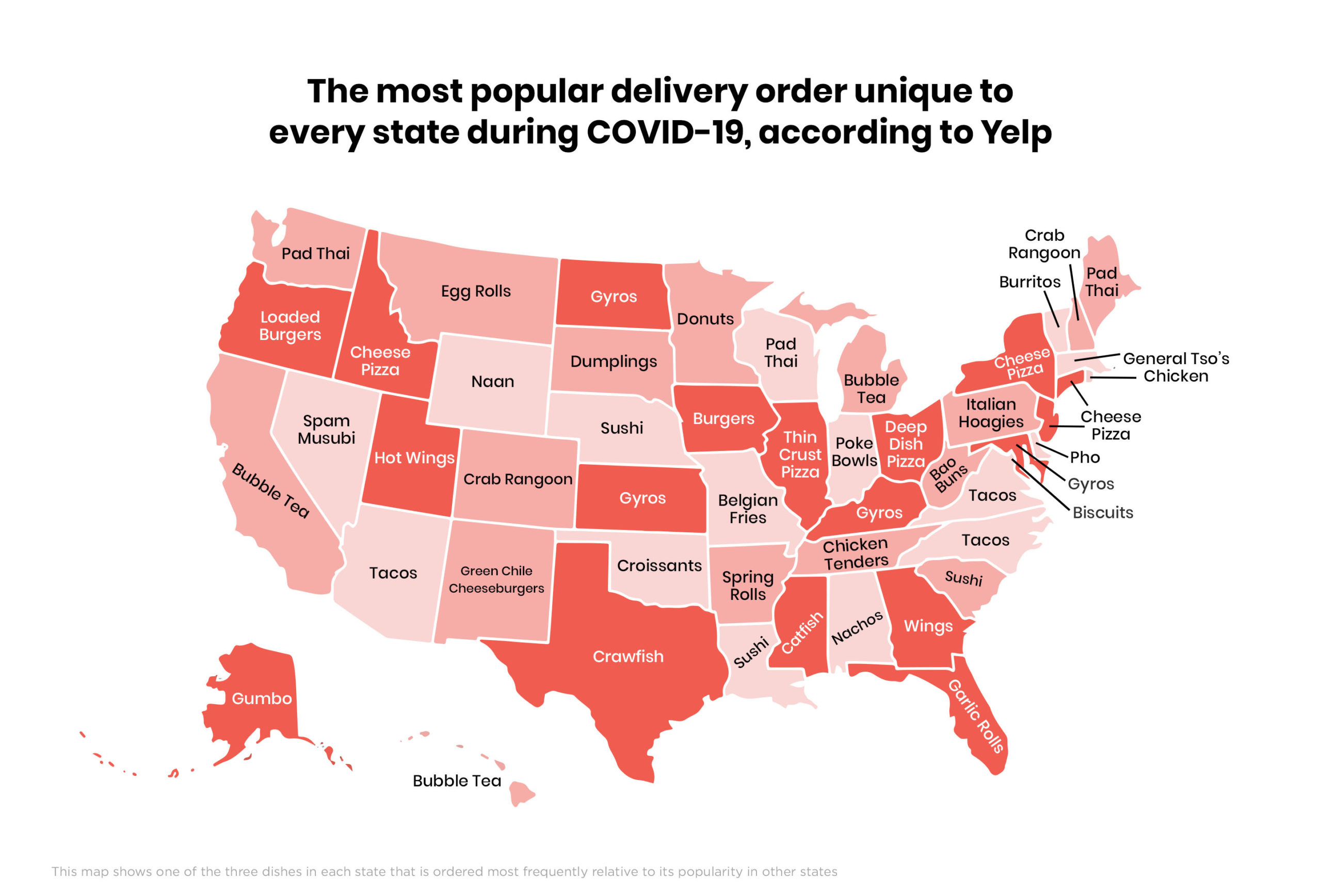
We'll wrap up the chartbook this week with a fun one: Popular/Unique Delivery foods from each state. Some of the choices are strange. Some don't hold up well in delivery/takeout scenarios. And some sound great!
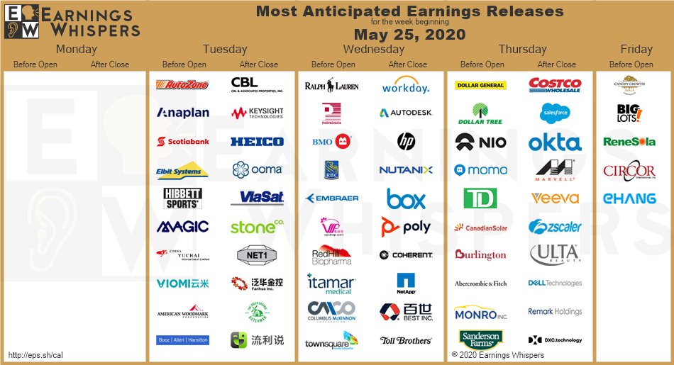
Here's the earnings calendar for the week:
Our early plan for the week is to put on more shorts. We chose to reduce our short exposure from ~20% to ~10% for the weekend because you never know what news can come out - and having an overly aggressive position might hurt. Our Unequal Pair Trade could be put back on. Shorting the retail sector might happen. And likely taking off the GDX position. Combine the 3 ideas and we've got our exposure back to being short as ever.
Comments
Post a Comment